Question 1
A publishing group has requested a dashboard to track submissions before publication. A key
requirement is that all changes are tracked, as multiple users will be checking out documents and
editing them before submissions are considered final. Which of the following is the BEST way to
meet this stakeholder requirement?
- A. Display the version number next to each submission on the dashboard.
- B. Present a data refresh date at the top of the dashboard.
- C. Confirm the dashboard is adhering to the corporate style guide.
- D. Use permissions to ensure users only see certain versions of the submissions.
Answer:
A
Explanation:
A static report is a type of report that shows a snapshot of data at a specific point in time. A static
report does not change or update automatically, unless the data source is refreshed or the report is
regenerated. A static report is suitable for situations where the data does not change frequently or
where historical data is needed for comparison or analysis. In this case, the data analyst is asked to
create a sales report for the second-quarter 2020 board meeting, which will include a review of the
business’s performance through the second quarter. The board meeting will be held on July 15, 2020,
after the numbers are finalized. This means that the data analyst does not need to show real-time or
dynamic data, but rather a fixed and accurate view of the sales data for the second quarter.
Therefore, a static report would be the best way to meet this stakeholder requirement. Therefore,
the correct answer is A. Reference: What are Static Reports? | Sisense, Static vs Dynamic Reports -
What’s The Difference? | datapine
Comments
Question 2
The number of phone calls that the call center receives in a day is an example of:
- A. continuous data.
- B. categorical data.
- C. ordinal data.
- D. discrete data.
Answer:
D
Explanation:
Discrete data is a type of data that can only take certain values, usually whole numbers or integers.
Discrete data can be counted, but not measured. For example, the number of students in a class, the
number of books in a library, or the number of phone calls that a call center receives in a day are all
examples of discrete data. Discrete data is different from continuous data, which can take any value
within a range, and can be measured with precision. For example, the height of a person, the weight
of a fruit, or the temperature of a room are all examples of continuous data. Therefore, the correct
answer is D. Reference: [Discrete vs Continuous Data: Definition and Examples - Statistics How To],
[Discrete Data - Definition and Examples | Math Goodies]
Comments
Question 3
A data analyst is asked to create a sales report for the second-quarter 2020 board meeting, which
will include a review of the business’s performance through the second quarter. The board meeting
will be held on July 15, 2020, after the numbers are finalized. Which of the following report types
should the data analyst create?
- A. Static
- B. Real-time
- C. Self-service
- D. Dynamic
Answer:
A
Explanation:
A dynamic report is a type of report that shows data that changes or updates automatically based on
certain criteria or parameters. A dynamic report can allow users to interact with the data, filter it,
drill down into it, or visualize it in different ways. A dynamic report is suitable for situations where
the data changes frequently or where real-time or near-real-time data is needed for decision making
or analysis. In this case, the data analyst is asked to create a sales report for the second-quarter 2020
board meeting, which will include a review of the business’s performance through the second
quarter. The board meeting will be held on July 15, 2020, after the numbers are finalized. This means
that the data analyst does not need to show real-time or dynamic data, but rather a fixed and
accurate view of the sales data for the second quarter. Therefore, a static report would be the best
way to meet this stakeholder requirement. Therefore, the correct answer is A. Reference: [What are
Dynamic Reports? | Sisense], Static vs Dynamic Reports - What’s The Difference? | datapine
Comments
Question 4
Which of the following would be considered non-personally identifiable information?
- A. Cell phone device name
- B. Customer’s name
- C. Government ID number
- D. Telephone number
Answer:
A
Explanation:
Non-personally identifiable information (non-PII) is any data that cannot be used to identify, contact,
or locate a specific individual, either alone or combined with other sources. Non-PII can include
aggregated statistics, anonymous data, device identifiers, IP addresses, cookies, and other types of
information that do not reveal the identity or location of a person. Cell phone device name is an
example of non-PII, as it does not reveal any personal information about the owner or user of the
device. Therefore, the correct answer is A. Reference: What is Non-Personally Identifiable
Information (Non-PII)? | Definition and Examples, What is Personally Identifiable Information (PII)? |
Definition and Examples
Comments
Question 5
Which of the following is a common data analytics tool that is also used as an interpreted, high-level,
general-purpose programming language?
- A. SAS
- B. Microsoft Power BI
- C. IBM SPSS
- D. Python
Answer:
D
Explanation:
Python is a common data analytics tool that is also used as an interpreted, high-level, general-
purpose programming language. Python has a simple and expressive syntax that makes it easy to
read and write code. Python also has a rich set of libraries and frameworks that support various tasks
and applications in data analytics, such as data manipulation, visualization, machine learning, natural
language processing, web scraping, and more. Some examples of popular Python libraries for data
analytics are pandas, numpy, matplotlib, seaborn, scikit-learn, nltk, and beautifulsoup. Python is
different from other data analytics tools that are not programming languages but rather software
applications or platforms that provide graphical user interfaces (GUIs) for data analysis and
visualization. Some examples of these tools are SAS, Microsoft Power BI, IBM SPSS. Therefore, the
correct answer is D. Reference: [What is Python? | Definition and Examples], [Python Libraries for
Data Science]
Comments
Question 6
A data analyst needs to present the results of an online marketing campaign to the marketing
manager. The manager wants to see the most important KPIs and measure the return on marketing
investment. Which of the following should the data analyst use to BEST communicate this
information to the manager?
- A. A real-time monitor that allows the manager to view performance the day the campaign was launched
- B. A sell-service dashboard that allows the manager to look at the company’s annual budget performance
- C. A spreadsheet of the raw data from all marketing campaigns and channels
- D. A summary with statistics, conclusions, and recommendations from the data analyst
Answer:
D
Explanation:
A summary with statistics, conclusions, and recommendations from the data analyst is the best way
to communicate the results of an online marketing campaign to the marketing manager. A summary
can provide a concise and clear overview of the most important KPIs and measure the return on
marketing investment, as well as highlight the main findings and insights from the data analysis. A
summary can also include actionable suggestions and best practices for improving the campaign
performance and achieving the marketing objectives. A summary is different from other options,
such as a real-time monitor, a self-service dashboard, or a spreadsheet of raw data, which may not
provide enough context, interpretation, or guidance for the manager. Therefore, the correct answer
is D. Reference: How to Write a Data Analysis Report: 6 Essential Tips, How to Write a Marketing
Report (with Pictures) - wikiHow
Comments
Question 7
A data analyst for a media company needs to determine the most popular movie genre. Given the
table below: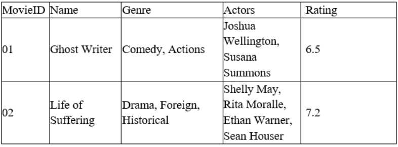
Which of the following must be done to the Genre column before this task can be completed?
- A. Append
- B. Merge
- C. Concatenate
- D. Delimit
Answer:
D
Explanation:
Delimiting is the process of splitting a column of data into multiple columns based on a separator or
delimiter character. Delimiting can help separate data that is combined or concatenated in one
column into distinct values or categories. For example, if a column contains text values that are
separated by commas, such as “Comedy, Suspense”, delimiting can split this column into two
columns, one for “Comedy” and one for “Suspense”. Delimiting is different from other options, such
as appending, merging, or concatenating, which are methods of combining or joining data from
multiple columns or sources. In this case, the data analyst needs to determine the most popular
movie genre based on the Genre column in the table. However, this column contains multiplegenres
for each movie, separated by commas. Therefore, the data analyst must delimit this column before
this task can be completed. Therefore, the correct answer is D. Reference: Split text into different
columns with functions - Office Support, How to Split Text in Excel (Using Formulas & Split Function)
Comments
Question 8
An e-commerce company recently tested a new website layout. The website was tested by a test
group of customers, and an old website was presented to a control group. The table below shows the
percentage of users in each group who made purchases on the websites: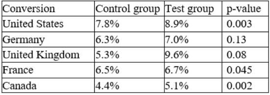
Which of the following conclusions is accurate at a 95% confidence interval?
- A. In Germany, the increase in conversion from the new layout was not significant.
- B. In France, the increase in conversion from the new layout was not significant.
- C. In general, users who visit the new website are more likely to make a purchase.
- D. The new layout has the lowest conversion rates in the United Kingdom.
Answer:
A
Explanation:
The p-value is a measure of how likely it is to observe a difference in conversion rates as large or
larger than the one observed, assuming that there is no difference between the groups. A common
threshold for statistical significance is 0.05, meaning that there is a 5% or less chance of observing
such a difference by chance alone. The table shows the p-values for each country, and we can see
that only Germany has a p-value above 0.05 (0.13). This means that we cannot reject the null
hypothesis that there is no difference in conversion rates between the test and control groups in
Germany. Therefore, the increase in conversion from the new layout was not significant in Germany.
For the other countries, the p-values are below 0.05, indicating that the increase in conversion from
the new layout was statistically significant. Option A is correct.
Option B is incorrect because the increase in conversion from the new layout was significant in
France (p-value = 0.002).
Option C is incorrect because it does not account for the variation across countries. While the overall
conversion rate for the test group (8.4%) is higher than the control group (6.8%), this difference may
not be statistically significant when we consider the country-specific effects.
Option D is incorrect because the new layout has the highest conversion rate in the United Kingdom
(9.6%), not the lowest.
Reference:
P-value Calculator & Statistical Significance Calculator
p-value Calculator | Formula | Interpretation
How to obtain the P value from a confidence interval | The BMJ
Confidence Intervals &P-values for Percent Change / Relative Difference
Comments
Question 9
An analyst needs to provide a chart to identify the composition between the categories of the survey
response data set: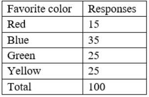
Which of the following charts would be BEST to use?
- A. Histogram
- B. Pie
- C. Line
- D. Scatter pot
- E. Waterfall
Answer:
B
Explanation:
A pie chart is the best choice to show the composition between the categories of the survey
response data set. A pie chart represents the whole with a circle, divided by slices into parts. Each
slice shows the relative size of each category as a percentage of the total. A pie chart is useful when
the categories are mutually exclusive and add up to 100%. The table shows the favorite color and the
number of responses for each color, which can be easily converted into percentages. A pie chart can
show how each color contributes to the total number of responses.
Option A is incorrect because a histogram is used to show how data points are distributed along a
numerical scale. The survey response data set is not numerical, but categorical.
Option C is incorrect because a line chart is used to show trends or changes over time. The survey
response data set does not have a time dimension.
Option D is incorrect because a scatter plot is used to show the relationship between two numerical
variables. The survey response data set does not have two numerical variables.
Option E is incorrect because a waterfall chart is used to show how an initial value is increased or
decreased by a series of intermediate values. The survey response data set does not have an initial
value or intermediate values.
Reference:
How to Choose the Right Chart for Your Data - Infogram
How to Choose the Right Data Visualization | Tutorial by Chartio
Find the Best Visualizations for Your Metrics - The Data School
How to choose the best chart or graph for your data
Comments
Question 10
Five dogs have the following heights in millimeters:
300, 430, 170, 470, 600
Which of the following is the mean height for the five dogs?
- A. 394mm
- B. 405mm
- C. 493mm
- D. 504mm
Answer:
A
Explanation:
The mean height for the five dogs is calculated by adding up all the heights and dividing by the
number of dogs. The formula is:
mean = (300 + 430 + 170 + 470 + 600) / 5 mean = 1970 / 5 mean = 394
Therefore, option A is correct.
Option B is incorrect because it is the median height, which is the middle value when the heights are
arranged in ascending order.
Option C is incorrect because it is the mean height multiplied by 1.25.
Option D is incorrect because it is the mean height multiplied by 1.28.
Comments
Page 1 out of 36
Viewing questions 1-10 out of 363
page 2