Question 1
When changing the Fallout visualization from Eventual Path to Next Hit, the analyst notices that the
data reports zero Visitors across the report.
Why would this occur?
- A. Across all visitors, the fallout depicted never was completed as a next step conversion.
- B. Across all visitors, the fallout depicted never was completed as an eventual path conversion.
- C. There was no direct path from the second and third fallout touchpoints.
Answer:
A
Explanation:
When changing the Fallout visualization from Eventual Path to Next Hit, the report shows only the
conversions that happened in the immediate next hit after each step. If the report shows zero visitors
across the report, it means that none of the visitors completed the fallout as a next step conversion.
References:
https://experienceleague.adobe.com/docs/analytics/analyze/analysis-workspace/visualizations/fallout.html?lang=en#next-hit-vs-eventual-path
Comments
Question 2
The conversion percentage from one step to another in a Fallout Visualization is 104%. What could
be the reason the percentage is over 100%?
- A. The success event can be fired outside of the specified funnel order.
- B. Success events cannot be added to a funnel.
- C. Another report suite's data is polluting the funnel.
Answer:
A
Explanation:
The Fallout visualization can show a conversion percentage over 100% if the success event can be
fired outside of the specified funnel order. For example, if a visitor completes a purchase before
viewing a product, the purchase event will still be counted in the fallout even though it happened
before the product view event.
References:
https://experienceleague.adobe.com/docs/analytics/analyze/analysis-workspace/visualizations/fallout.html?lang=en#over-100-percent-conversion
Comments
Question 3
A web analyst is viewing a report in an Analysis Workspace freeform table and sees a dark gray
triangle.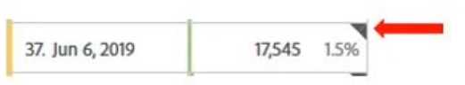
What is this specifying in the report?
- A. Data includes outside data source
- B. Incomplete data
- C. Data anomaly detected
Answer:
C
Explanation:
A dark gray triangle in a report indicates that a data anomaly has been detected for that data point. It
means that the value is significantly different from the expected range based on historical data and
seasonality.
References:
https://experienceleague.adobe.com/docs/analytics/analyze/analysis-workspace/predictive-analytics/anomaly-detection.html?lang=en#anomaly-detection-in-analysis-
workspace
Comments
Question 4
An analyst wants to use all of the following variables to configure a single fallout report:
• Landing page prop
• Marketing channel eVar
• Product view event
• Purchase event
• Product category eVar
Which tool should the analyst use?
- A. Segment builder
- B. Workspace
- C. Reports and analysis
Answer:
B
Explanation:
Workspace is a tool that allows you to create interactive and customizable reports using various
visualizations and components. It can also support multiple variables in a single fallout report, unlike
segment builder or reports and analysis.
References:
https://experienceleague.adobe.com/docs/analytics/analyze/analysis-workspace/analysis-workspace.html?lang=en
https://experienceleague.adobe.com/docs/analytics/analyze/analysis-workspace/visualizations/fallout.html?lang=en#creating-a-fallout-visualization
Comments
Question 5
Which option would an analyst choose to show the percentage change between the two numbers in
a visualization?
- A. Use the Summary Change visualization from a Freeform Table, click the Visualization settings, and O select Show Raw Difference
- B. Use the Summary Change visualization, click the Visualization settings, and select Show Percent ,#l Change
- C. Use the Summary Number visualization, click the Visualization settings, and select Percentages
Answer:
B
Explanation:
The Summary Change visualization shows the difference between two numbers in a report, such as
current period vs previous period. To show the percentage change between the two numbers, you
need to click the Visualization settings and select Show Percent Change.
References:
https://experienceleague.adobe.com/docs/analytics/analyze/analysis-workspace/visualizations/summary-change.html?lang=en
Comments
Question 6
In Analysis Workspace, what are two ways a Map Visualization can be built? (Choose two.)
- A. Representing geo segmentation data about visitor location on the DMA or Zip Code level
- B. Using IP address or Latitude/Longitude
- C. Building a Map Visualization using one metric (including calculated metrics)
- D. Building a Map Visualization using two or more metrics (including calculated metrics)
Answer:
A, C
Explanation:
A Map Visualization can be built by representing geo segmentation data about visitor location on the
DMA or Zip Code level, which are two dimensions that can be used in a map. Alternatively, a Map
Visualization can be built by using one metric (including calculated metrics) that can be applied to
any dimension that has geographic data associated with it, such as country or region.
References:
https://experienceleague.adobe.com/docs/analytics/analyze/analysis-workspace/visualizations/map.html?lang=en
https://experienceleague.adobe.com/docs/analytics/analyze/analysis-workspace/visualizations/map.html?lang=en#map-visualization-requirements
Comments
Question 7
What is the correct functionality when setting up Intelligent Alerts?
- A. Send an alert by SMS with a link to your Analysis Workspace project
- B. Send an alert by e-mail or SMS with a link to an auto-generated Analysis Workspace project
- C. Send an alert by e-mail with a link to your Analysis Workspace project
Answer:
C
Explanation:
Intelligent Alerts is a feature that allows you to set up alerts based on data anomalies or thresholds
in your Analysis Workspace projects. You can choose to send an alert by e-mail with a link to your
Analysis Workspace project when the alert is triggered. You cannot send an alert by SMS or with a
link to an auto-generated Analysis Workspace project.
References:
https://experienceleague.adobe.com/docs/analytics/analyze/analysis-workspace/predictive-analytics/intelligent-alerts.html?lang=en
https://experienceleague.adobe.com/docs/analytics/analyze/analysis-workspace/predictive-analytics/intelligent-alerts.html?lang=en#intelligent-alerts-in-analysis-workspace
Comments
Question 8
The analytics team has created an Analysis Workspace project featuring a Freeform Table and a Flow
Visualization in one Panel.
Why is the scheduled report just showing the Panel Name?
- A. The Freeform Table and Flow Visualization were expanded.
- B. The Project was never curated.
- C. The Freeform Table and Flow Visualization in the Panel were minimized.
Answer:
C
Explanation:
When scheduling a report from an Analysis Workspace project, only the expanded visualizations in
each panel will be included in the report. If the Freeform Table and Flow Visualization in the Panel
were minimized, they will not show up in the scheduled report, only the Panel Name will.
References:
https://experienceleague.adobe.com/docs/analytics/analyze/analysis-workspace/share/schedule-project.html?lang=en
https://experienceleague.adobe.com/docs/analytics/analyze/analysis-workspace/share/schedule-project.html?lang=en#schedule-a-project
Comments
Question 9
A UI/UX manager asks an analyst to create an Analysis workspace visualization that shows all visits to
English (/En) pages. The workspace is accessible by multiple stakeholders, most of whom have edit
access.
Which visualization approach would be used?
- A. Create a Freeform Table with Page Name and Visits. Filter Page Name by "ends with = /en"
- B. Create a Freeform Table with Page Name and Visits. Filter Page Name by "contains = /en"
- C. Create a Freeform Table with Visits and drag and drop all Page Names that contain "/en" from the left rail into the rows of the Freeform Table.
Answer:
B
Explanation:
The best way to create an Analysis Workspace visualization that shows all visits to English (/en) pages
is to create a Freeform Table with Page Name and Visits, and then apply a filter to Page Name by
“contains = /en”. This will ensure that only the pages that have “/en” in their name will be shown in
the table, regardless of their position in the URL. Filtering by “ends with = /en” would exclude pages
that have other parameters after “/en”, and dragging and dropping all Page Names that contain
“/en” would be tedious and prone to errors.
References:
https://experienceleague.adobe.com/docs/analytics/analyze/analysis-workspace/build/freeform-tables.html?lang=en
https://experienceleague.adobe.com/docs/analytics/analyze/analysis-workspace/build/freeform-tables.html?lang=en#filtering-data-in-a-freeform-table
Comments
Question 10
A chart displaying the daily trend of Orders and their performance against the daily average for the
last month is needed.
How can this requirement be met?
- A. Use a Line Visualization to trend the Orders and the daily average as a Calculated Metric in the same chart.
- B. Use a Bullet Visualization to trend the Orders and Day dimension in the same chart.
- C. Use a Histogram Visualization to trend the Orders and enable the settings to show the trend against the average value.
Answer:
A
Explanation:
The best way to display the daily trend of Orders and their performance against the daily average for
the last month is to use a Line Visualization to trend the Orders and the daily average as a Calculated
Metric in the same chart. A Calculated Metric can be created by using the Average function on
Orders and applying a date range of last month. A Line Visualization can show both metrics as lines
on the same chart, allowing for easy comparison.
References:
https://experienceleague.adobe.com/docs/analytics/analyze/analysis-workspace/calculated-metrics/calculated-metrics-overview.html?lang=en
https://experienceleague.adobe.com/docs/analytics/analyze/analysis-workspace/calculated-metrics/calculated-metrics-overview.html?lang=en#creating-a-calculated-metric
https://experienceleague.adobe.com/docs/analytics/analyze/analysis-workspace/visualizations/line-
visualization.html?lang=en
Comments
Page 1 out of 4
Viewing questions 1-10 out of 50
page 2